
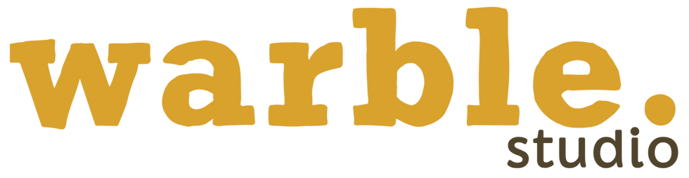
The Warble Studio Logo: What’s In A Name
The story behind our new logo, and what the name has always meant to us.
Warble Studio was born in 2020— the product of a pandemic, a partnership, and a decision to build something of our own rather than wait for the world to sort itself out.
We started as a design studio focused on small businesses and solo entrepreneurs; people who couldn’t afford high-end designers but still needed quality work. We’d help them build their brands while building something of our own. A win-win situation.
The Original Warble Studio Logo
Necessity, they say, is the mother of invention. They also say, “Do what you can where you are with what you have.” We don’t know who they are, but they had a point.
When we created the first Warble Studio logo, we didn’t overthink it. We needed something we could slap onto all our makeshift collateral and upload to our freshly purchased corner of the internet. We picked two brand fonts and settled on a colour palette consisting mostly of greys and one determined shade of yellow, which we had to negotiate to keep, and we’re glad we did. Warble Yellow is still a part of our identity.
The name Warble itself? That’s a story for another day, but here’s what you need to know:
Warble (verb): (of a bird) sing softly and with a succession of constantly changing notes.
We believed our small, diligent actions would echo into something big. Think” making waves.

Why Change the Logo?
By August 2024, Warble Studio had grown, paused and was gearing up for a new chapter. We’d both been feeling nudges to revisit our business structure, and when we got to talking about it, it turned out we’d independently arrived at the same conclusion. So, we got to work. While the full rebrand was (and still is) a work in progress, one thing became clear quickly:
We needed a new logo. And we wanted it to:
Convey the message behind the name
Combine important aspects of both co-founders
Communicate professionalism across all our customer categories
So the logo exploration began. Extensively.
We went through a bajillion options (okay, maybe not literally, but it felt like it). Since we wanted the logo to reflect “making waves”, we explored possible ways to visualise sound waves, echoes and vibrations. We had a board filled with references of varying relevance and sketches attempting to capture the essence of what we were after.
At first, we avoided creating a wordmark entirely. We were after something symbolic— an icon that could become instantly recognisable. But as we expanded our metaphor pool, the sound wave concept grew to include light waves. We started looking at kaleidoscopes, and that’s the point where things got interesting.
We started asking ourselves: What if we represented waves in a way that was more tangible than sound? What if we took the concept of “Warble” and translated it into something you could actually see?

The “Aha!” Moment: What’s in a Name?
At this point, we had to admit something to ourselves: Warble as a word had come to mean a lot to us. Over the past four years, we have embodied its essence in starting small, making strategic moves, and trusting that our contributions would build something significant.
It was obvious that the way we were going to make a statement about the name was to use the name itself.
So, we stopped resisting the word mark idea we’d been running from and leaned into it instead. The final logo is an attempt to blend the solidness of a name with the visual energy of the sturdy vibrations it represents.
Beyond that, it:
Balances professionalism with personality— Serif typefaces naturally command respect, and we wanted that authority on our branding.
Reflects our partnership— It subtly represents the complementary strengths of both founders: Debbie’s curated, strategic order and Ari's calculated chaos.
Maintains flexibility— Even though it’s type-based, we were able to create a recognisable logo mark from it, keeping our goal of future brand recognition intact.

What This Means for Warble Studio
Warble Studio is still as committed to doing giant things from small places as we were when we started. But this logo redesign wasn’t just about aesthetics; it was an opportunity to reflect on what it means to be Warble, and to ensure our identity is clear at every touch point.
It also pushed us to think beyond the logo to the bigger picture of brand perception, and how we embody the very ideas we help our clients bring to life.
Which brings us to the obvious question: What are we building towards?
We’re here to help ambitious businesses build trust, attract the right opportunities and create visual systems that support where they’re headed next. Whether you’re launching something new, refining what already exists, or preparing for your next stage of growth, we’ll help you craft a brand and digital presence that feels intentional from the inside out.
That’s what the new logo represents, and it’s what we show up to do every day. Does that sound like a good sell to you?


Comments